|
SUNDAY EDITION July 12th, 2026 |
|
Home :: Archives :: Contact |
|
|
Is the Decline of Base Production Accelerating?
from The Oil Drum :: posted by Stuart Staniford
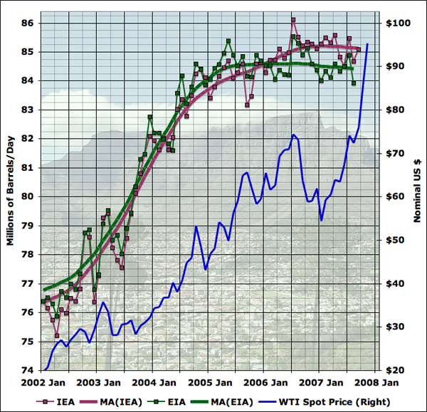
This analysis looks at how existing oil fields are apparently declining, and finds a trend suggesting those declines are worsening, though the reasons for this are not clear yet. Note: In the course of preparing this piece, there was a lot of back-and-forth on the Oil Drum editors-and-contributors list, and Khebab and I realized we were working on related analyses with broadly similar conclusions, and agreed to publish them on the same day. I encourage you to read his piece also. I began this post because JD of Peak Oil Debunked has recently reemerged from voluntary retirement (possibly as a result of near $100 oil) and was tweaking me about an old piece of mine from two years ago. That analysis looked at several pieces of evidence for a "decline rate" at 8% (probably not all the same kind of decline rate) and pointed out the scenario of adding known new capacity to an 8% decline rate in existing production would be a bad thing. JD notes that production since then hasn't declined as fast as that scenario suggested. I think he's making the piece out to have taken a much more certain position than it really took (it was a scenario, not a forecast, and I plotted several others). Nonetheless, the tone of the piece now reads to me as too gleefully "Isn't this scary?" That is a fault I resolve to try and avoid in future. I pretty much decided that whole style of bottom-up megaproject analysis was not very useful around that time after this look at Saudi megaprojects and production. But, we know far more than we did in November 2005 and it seems to me that there are now interesting insights to be had from looking at the megaprojects and the various decline rates they imply. In particular, one of the biggest things we know now that we didn't know then is that global oil production has been close to flat during that time, as prices have continued to go up and up. The latest publicly available data looks like this:
As you can see the EIA, once you smooth out the month to month noise, shows global liquid fuel production as essentially flat since mid 2005. The IEA shows production continuing to increase to late 2006, but being flat for the last year. Since the world economy has been mostly healthy during that time, the price of oil has skyrocketed. It's less than six years ago that oil was still below $20, but it's now over $90. Obviously, we'd very much like to know what the future holds. One of the central factors in the future of oil production is the ability of the oil industry to bring on new capacity. Economists generally believe that industry will respond to a period of high prices by bringing more supply to market, albeit with some lag since oil industry projects are large complex undertakings that take a number of years from inception to actual oil flowing into tankers. A number of people attempt to enumerate such projects, and the best known of the enumerations that's actually publicly available is a series by Chris Skrebowski, a long time oil market analyst and editor of Petroleum Review. The reports each consist of a list of the projects with name, the year of first oil production, and the peak flow of liquid fuel expected from that project. The reports in some cases have a tabulation of the new capacity, and conclude with some commentary on the implications for future oil supply. What's very interesting is that we now have four versions of Skrebowski's megaproject report, which gives us a much better ability to analyze trends. The four I can find publicly available on the Internet are these:
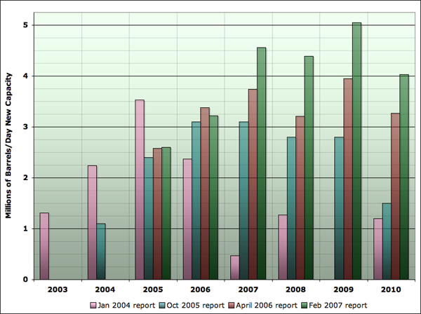
After the date of the report, I've noted the cutoff of minimum size of project included in the list. This has changed over time, which is one source of methodological difference between the reports. I'll explore it further in a moment. But I think the best way to get a quick feeling for the trends is the following graph (based on an idea from Euan Mearns). It shows the total amount of peak capacity anticipated to start production in each year, and does so for all four reports. I have stopped the graph at 2010, as the timeframe of interest in today's analysis does not go past that.
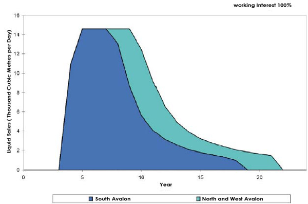
I think two points emerge clearly from this graph. Firstly, megaproject analysis at present gets increasingly inaccurate after a year or two. If you look at the years 2007-2009, the various reports are in fairly significant disagreement about how much oil is going to come on stream in that year. On the other hand, if you look at 2005 and 2006, the 2005, 2006, and 2007 reports are in fair agreement. So there seems to be a process in which the lists are fairly inaccurate several years out, but converge to a stable answer as we get to reporting on this year or next. In the early years, 2003 to 2005, when oil prices were lower, project totals tended to drop from the first estimate. In recent and future years, project totals tend to grow with each passing report. It may be in part that transparency in the industry is improving. However, it also seems likely that high prices are causing additional capacity to materialize. The other notable trend in the graph above is that it's rising strongly - starting out at just over 1mbd of new megaprojects coming on stream in 2003, we rise to over 5mbd of new projects currently anticipated in 2009. The overall trend is that new capacity per year is itself increasing at a little less than 1mbd each year. It's hard to believe that this isn't a response to the high prices of the last few years. I want to stress an important caveat before we move on. The megaproject reports give the estimated peak flow from a project, but place it in the year in which it first delivers any oil. It's very likely that the production does not reach the peak value on day one, but instead ramps up over a period of months or even years. For an example, look at the front side of the curve on this originally planned production curve for the White Rose field in Canada:
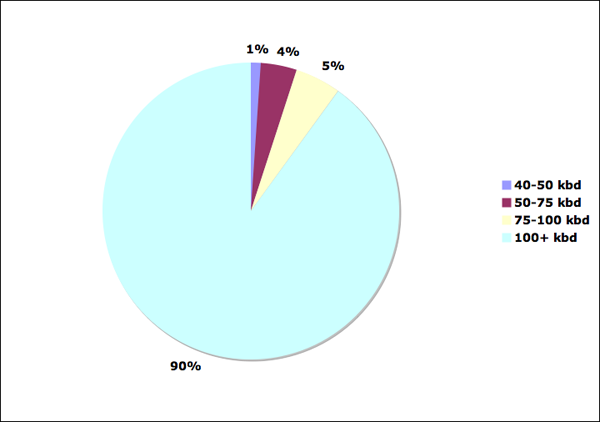
However, in almost all cases, we have no information about the shape of the production profile of a new field project: just the date of first oil and the peak flow. Thus we must adopt some convention of how to treat the dating of the flows, but this will inevitably introduce some error into any analysis, and we will need an argument that our conclusions are not obviated by any such error. I would like to deal with another potential caveat, here, which is the changing size of the limit in the different megaproject reports. Is this an important contaminating effect? To analyze this, I looked at the amount of capacity in the 2007 report, which with a 40kbd limit is the most comprehensive. I looked at the projects only through 2010 (to limit the degree to which far off years might miss more small projects than big ones), and analyzed the fraction of capacity that would have been missed with the 2006 limit (50kbd), the 2005 project limit (75kbd), and the 2004 project limit (100kbd).
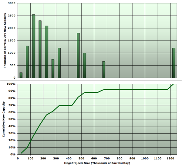
It turns out that the 2007 criteria would only increase capacity by 1% over the 2006 criteria, and only by 5% over the 2005 criteria. Thus the change in size grade is a minor contribution to the growth in tabulated capacity from report to report. Indeed, more generally, small fields are probably not a massive contribution to capacity. I plotted the same list of fields in a histogram of the amount of capacity being added by each size grade of projects (in 50kbd wide bins), and then computed the cumulative density function from that. Both are shown here:
You can see that the left hand side of the distribution is trailing off sharply, and it's not very likely that the fact that the distribution has been cut off on the low side at 40kbd has missed a huge fraction of capacity. Before we dive into further detail, let me summarize the two qualitative facts that drive the analysis presented here. I claim:
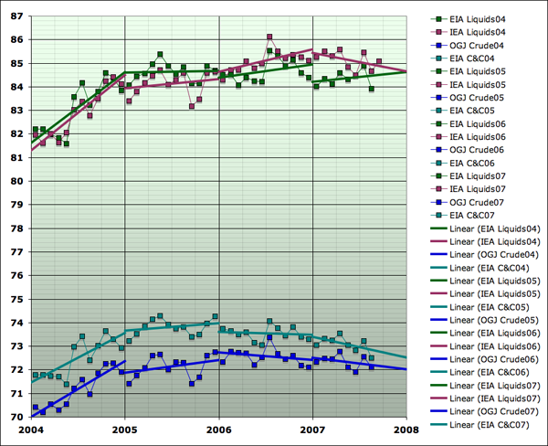
Keep those in mind as we go forward. Even if you disagree with me in detail here and there, I think that if you accept those two facts as basically fair descriptions of the big picture, you'll end up being forced to accept some version of my conclusion. To preview my argument, essentially I'm going to say that since more and more capacity is coming on stream each year, but is only succeeding in keeping production flat, the other things that affect production, besides new tabulated megaprojects, must be getting steadily worse. Let's now drill into those facts in more quantitative detail, and you can see whether you are persuaded or not. I first want to look much more carefully at the flattening of global production. This implies that the rate of change of production over time has been getting lower. To assess this, I looked at four different data series. The reason for this is that different agencies and organizations disagree on the amount of oil produced each month. Additionally, it's possible to focus on narrower or broader definitions of oil (whether or not to include very light liquids known as condensate, compounds that condense out of natural gas (called NGLs), production from tar sands, biofuels etc). I generally prefer only to draw conclusions which are not too sensitive to exactly which definition or series we look at. An effect seen only in one series is probably not very robust. Similarly, I don't like to be too dependent on the values in any particular month (since month-to-month production jumps around noisily), so I like to use some kind of average or trend-fitting as well. The four global production series used in this analysis are shown as follows from Jan 2004 to the most recent month available publicly:
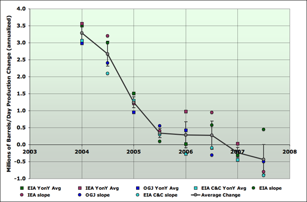
Since I'm interested in rates of change, and how the rate of change is changing I've also shown a linear trend for each series: I constructed a separate trend for each year. As you can see, the series vary a little bit in their degree of optimism/pessimism. The IEA total liquids series is the one that has been the most optimistic, and the EIA crude plus condensate series is the one that looks most like it's already declining. The other two are somewhere in between. From that graph, I computed the next one, which shows an estimate for the rate of change of each production series over time. I constructed estimates in two ways. At year boundaries, I took the year on year change. At mid-years, I used the slope of the straight line fit in that year.
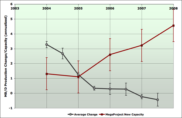
As you can see, although the various series have some spread in their estimates, there's little doubt that the rate of change headed rapidly to around zero by mid 2005, and has since been hovering close to zero, but probably declining further at a slower rate. I have also shown on the graph an average of the different rates of change, and an error bar for that average. The error bars are computed as the standard error derived from the four data points shown at each year and half-year. These are not really statistical estimates, since the four data series are not random picks from some population, but rather different ways of defining oil and estimating the amount of it produced. Nonetheless, if one thinks of these as more or less random picks from the abstract ensemble of reasonable procedures for analyzing this problem, I think the error bars are still meaningful for making rough estimates of the amount of uncertainty that can be imputed to our trends, and thus whether or not I have proven my conclusions adequately. So with that, we can now compare the decelerating production with the accelerating new capacity on one chart. This next shows the same production change as in the last chart, except I dropped the estimates from the original series, keeping just the average and the error bar. Additionally, I introduced the amount of new megaproject capacity that is tabulated for each year. Megaproject capacity for each year is taken from the latest report that has a figure for that year. Capacity is credited at the end of the year it came on stream - thus the data point at 2004.0 is the 2003 megaproject capacity (taken from the 2004 report). Error bars are computed by taking the spread of the different reports in each year, and then using an RMS average to pool all years into a standard error bar. As before, this should be taken as a useful rough indication of the general level of uncertainty in the problem, but not a precise statistical statement. It may seem that this overstates the error bar, since earlier reports presumably have much less accurate tabulations than later ones. However, given the potential issues with slow ramp up of flows, I prefer to leave them as large as they are. It is possible that the entire megaproject capacity curve would really be shifted somewhat to the left or right if we fully understood the ramp-up profiles. However, it seems hard to believe that the basic shape of it being a rapid rise would be erased.
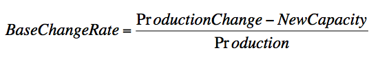
This graph fleshes out and makes more quantitative my basic claim that production has been flattening at the same time that new capacity is increasing. The implication of this is that the trends in things happening to production other than new capacity must be worsening. Before we look at the specifics of that, let's talk a little bit about terminology, since there is enormous potential for confusion here. As soon as we start talking about decline rates, people mean at least three different things that it's important we distinguish. Firstly, if we were to watch production for a median oil well somewhere in a median oil field, and didn't do anything to it except fix mechanical breakdowns in the operation, chances are that its production would be somewhat less over time. This would take many different forms - perhaps water would break through some strata in the rock into the well, perhaps pressure in the field would drop, perhaps the rock pores close to the well would become more clogged. In an individual well, these various decline processes would be quite random and non-uniform. However, if we imagine the thought experiment of doing this with all the oil wells in the world, or in some particular region of interest, presumably there would be some statistical averaging, and we could get an average rate of decline for the wells. Some wells would be in good rock with a thick oil layer, and would barely decline at all. Others might have a massive water breakthrough and experience almost 100% decline. But on average, there would be a certain percentage decline rate. We might expect this to increase over time, as more of the world's production assets are in a more mature state and more prone to problems of all types, but I'm not aware of any work quantifying this increase. Let's call this quantity the petrophysical decline rate: the average rate at which well production would decline on an annual percentage basis if no corrective action were taken. Now, in reality, the world's oilfield operators are busy taking corrective actions of all kinds. Wells are worked over or stimulated, water is shut-off down hole in various ways, new wells are drilled between the old ones, new zones are perforated that had previously been ignored, etc, etc. So when we take a fixed collection of fields that have been developed at some date, the average change in their production will be different than the petrophysical decline rate. Additionally, a variety of things affect production that are not directly related to oilfield operations, but affect them. Weather causes shutdowns of facilities, as do fires, accidents, earthquakes, revolutions, societal collapses, wars, and the operation of economics. In particular, the latter means that sometimes operators may deliberately shut in productive capacity and then sometimes they may turn on that capacity again. Furthermore, the diligence with which they go about fixing up their oilfields and trying to offset petrophysical declines will be influenced by oil prices, and perceptions thereof. Thus when we take a fixed set of oil fields and look at the change in it over time, there are a large number of factors that go into it, which we cannot easily separate out. The petrophysical decline rate is only one of them - though certainly an important one. So let's call give this quantity a name too: The base production growth/decline rate is the annualized percentage change in the production of some set of currently operating oilfields of interest due to all causes. There is one more rate of change which interests us. After the base production has done whatever it has done, the world (or some region) adds on new capacity in new fields, or previously undeveloped areas of existing fields large enough to be identifiable as separate new capacity projects. It is this activity that the megaproject lists attempt to capture. After the new capacity has been added onto the underlying base production of existing fields, we find out whether this was enough to grow production, or if in fact production declined. So we define: The net growth/decline rate is the annualized percentage change in the production of oil from all sources in the world, or some region of interest. This last decline rate is the one society really cares about. In my view it's the central thing that controls how easily society can adapt to the peaking of global oil supply, and it is the one that Hubbert linearization says should worsen only very slowly. However, the base production growth/decline rate is also of considerable interest, because it's directly related to the net growth/decline rate via the new capacity. So the worse the base production fares, the more new capacity is required to make up the difference. The petrophysical decline rate would be of great interest too, but, as far as I know, we have no public data with which to assess it. However, we can infer the base decline rate because we have public estimates of new capacity and also of production changes. So let's do that. Taking the estimates I showed in the last graph for production change and new capacity one can compute the base production growth/decline rate over time via
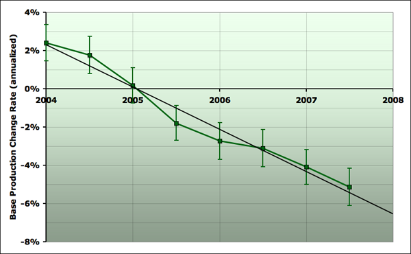
and here it is:
It doesn't really matter which series one uses to estimate production here, since the differences between them are proportionately much smaller than the other uncertainties in the problem, but I happened to divide by the EIA all liquids. Megaproject capacity totals are interpolated linearly to the mid-year points, so the mid-year points are not fully independent of the year-end points (the production change estimates are independent, however). So, this graph summarizes quantitatively what I've been talking about above. Flat production in the face of increasing new capacity means that the base production must be doing worse and worse. And indeed we see that base production has gone from increasing at over 2% per year at the beginning of 2004, to now decreasing at about 5% per year. And the trend has been close to linear over these (almost) four years - the base production growth/decline rate gets worse at about 2% (percentage points) per year. Now, I should emphasize here that it is not at all clear, at least to me, why this is happening. Given the way I've defined my terms, I'm very confident that it is happening (notice the trend is much larger than the error bars). But what it means is less certain. In particular, why this should be anything like a straight line is quite unclear. I think most of this discussion will have to happen another time, but it's worth making one point now. The increases in base production in 2004 were due in large measure to the deployment of previously spare Saudi capacity, and also the Russian revival, (which has largely not shown up as projects on the megaproject lists). These increases were large enough to overcome petrophysical declines and even increase base production. However, Saudi Arabia subsequently began to decline, and then has been roughly flat this year. Russia has continued to increase, but more and more slowly. So these things cannot explain most of the more recent acceleration in base decline. Here are some other candidate hypotheses we might consider:
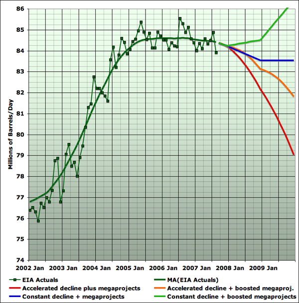
To explore the space of possibilities, this final graph presents four scenarios for total liquids production through the end of 2009.
The red curve assumes that a) the acceleration continues, with the same linear worsening of the base production decline rate, and b) new capacity comes on exactly as the 2007 megaproject report shows. As you can see, those assumptions cause the loss of about 5mbd over the next two and a bit years of production (about a 2 1/2% net decline rate). The orange curve assumes that a) the acceleration continues as with the red curve, but, noting that the megaproject lists have been tending to grow with time lately, also assumes b) that 2008 new capacity is 1mbd more than the megaproject list, and that 2009 is 2mbd more. That leads to a net decline of closer to 1% per year. The blue curve assumes that a) the acceleration stops, and base decline remains at the current 5.5% per year, b) new capacity comes on exactly as the 2007 megaproject report shows. That leads to a net decline of a little less than 1/2%/ year. Finally, the green curve makes the same assumptions about boosted new capacity as the orange curve, but like the blue curve supposes that the accelerating base decline stops, and decline stays at a fixed 5.5% rate. As you can see, that is enough to cause net production to grow, and postpone peak oil for some time longer. Overall, while there remains a lot of uncertainty, seeing this acceleration of base declines makes me lean a little further in the direction that the Russian situation of slowing production increases in the face of greatly increased rig counts also hinted at. Specifically, it suggests that perhaps by sometime in 2008 we will have unambiguous declines in total liquids production, rather than continued plateau. I'm not certain at this point, but that's the direction I lean.
from The Oil Drum :: posted by Stuart Staniford
|
| Home :: Archives :: Contact |
SUNDAY EDITION July 12th, 2026 © 2026 321energy.com |
|