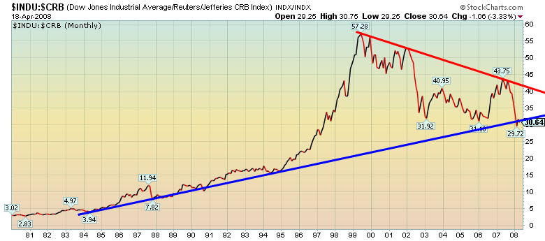
This chart (click to enlarge; all graphics in this article at Carlo Magnifico's website) illustrates how stocks began to underperform commodities as the recent commodity bull began. The methodology used here was to create a ratio by dividing the Dow Jones Industrial Average by the Reuters/Jefferies commodity index (the leading benchmark for commodities as an asset class). During commodity bear markets the Dow Jones Industrial average does well, while during commodity bulls it goes into the tank. The large symmetrical triangle has scary implications, explained below.
In real terms, in recent years the Dow Jones Industrial Average has been in a "stealth correction" - or, less generously, a silent crash. Growth in M3 money supply is now hidden, so it is not obvious that the US Fed is printing money at the astonishing (estimated) rate of 17% per year. One result is that, while in nominal terms the Dow has appeared fairly flat for the last couple of years, it has actually been in a tailspin.
It's dropping in euro, pound, yen, yuan and Canadian dollar terms, to name a few. More importantly, it is dropping in terms of real money (gold bullion) and other commodities - products from underground and from land and sea, the value of which is independent of the printing press. Since 2001, putting your money into traditional US equities has mostly been investing in a silent crash.
If you believe in technical indicators, that situation could get much worse. The chart explains this graphically. Technically speaking, its most important feature is that the two lines form a large symmetrical triangle. According to the massive classic on technical analysis, Edwards and Magee’s Technical Analysis of Stock Trends, roughly 75% of symmetrical triangles are continuation patterns – that is, they suggest a major turning point.
A breakout is a technical event in which a stock or commodity price “breaks out” above the high (or below the low) trading pattern lines that enclose other price points. Breakouts are used by technical analysts to predict substantial upside or downside movement. Think of them as a kind of tipping point. Critical mass creates unstoppable momentum.
Until we see a major breakout, in theory the chart could go either way. However, for the reasons this blog has been discussing for about a year, I believe the slight breakout we are now seeing is the beginning of a big drop. I have covered many of the causes – for example, dollar weakness, peak oil and its ties to gold prices, developments in the natural gas markets, Asian growth, financial crisis and so on – in earlier posts.
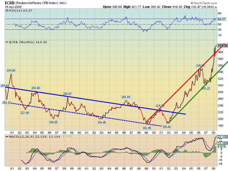
To understand the tremendous momentum behind the collapse in the Dow relative to commodities, you need to appreciate the strength of the commodity rally.
The chart above illustrates the power behind this commodity bull. The blue lines show the long, drawn-out collapse in commodity prices from 1980 to 2002. The red and green lines show a bull of tremendous virility – perhaps, if we can believe the recent breakout, one that is getting stronger still.
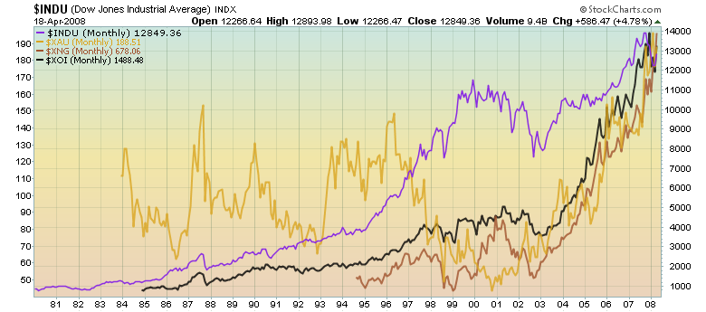
My last chart compares the performance of the Dow to those of proxy indexes for shares in oil (the XOI), natural gas (the XNG) and gold (the XAU). The strength is there. Like the commodities whose prices back up their profits, there is little sign of the commodity stocks slowing down.
Peter McKenzie-Brown
Email: pmbcomm@hotmail.com
languageinstinct.blogspot.com
April 23, 2008