|
TUESDAY EDITION June 9th, 2026 |
|
Home :: Archives :: Contact |
|
|
The Buck Stops Where?Peter McKenzie-BrownEmail: pmbcomm@hotmail.com languageinstinct.blogspot.com March 18, 2008
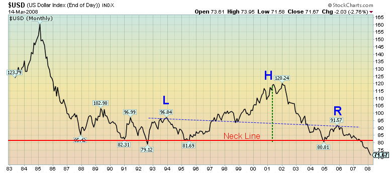
This long-term head-and-shoulders pattern suggests that the US dollar – measured against the currencies of its trading partners – has just begun a collapse toward the $0.40 level. One of the most common reversal formations, the head-and-shoulders pattern offers a rough measure of how painful the coming move will be. From the time the pattern broke through neckline support (mid-year 2007), you can project the coming price decline. First, measure the distance from the neckline to the top of the head (about 40 points). You then subtract this distance from the neckline (81 points) to reach the $0.40 price target. This is the third column in a series describing the relationships among the prices of gold, oil and other financial vehicles. The first concluded, in part, that the price we are paying for gold is directly related to the price we are paying for oil, and that gold's fast-moving price reflects a rapidly deteriorating situation in the petroleum industry. The second column used technical analysis to show the inverse relationship between stocks and commodities. When you are in a bull market for stocks, commodities decline, and vice versa. In this third and final commentary, I want to use technical analysis again, but this time to show how the fall of the US dollar fits into the picture. The chart above shows the volatility of the greenback over the last 25 years. It also shows the very worrying head-and-shoulders reversal pattern, which developed during a 15-year period. Why is the US dollar in such deep doodoo? Let me count the ways: trade deficits; government debt; consumer debt; a credit crisis; a housing crisis; a banking crisis; dependency on foreign oil; huge reserves in countries (China, Russia, Saudi Arabia) that have deep-seated issues with the US, and have recently been investing in other currencies to get better returns; US dollar outflows to invest in overseas assets; the transfer of manufacturing to overseas locations; an economy 70% dependent on consumer spending – and that is just a start. The blood-letting isn’t over yet, and that has important implications for both gold and oil. 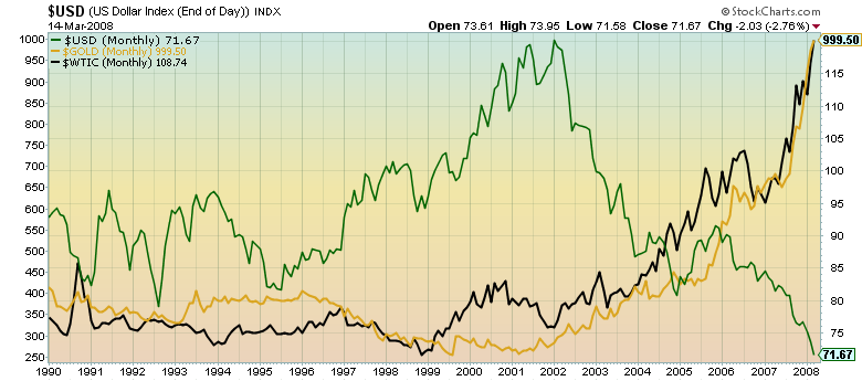 This chart shows how, like the Dow Jones Industrial Average, gold and oil prices move counter to the value of the US dollar – the currency in which most international commodities are now priced. Here are even more dramatic pictures of the same thing: 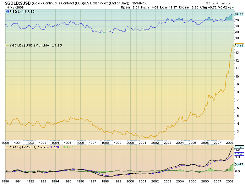
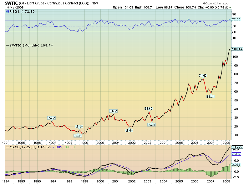 These charts factor the relative value of the dollar directly into the gold and oil charts. You can click on the charts to see them full-size, or view them and other graphics from this series, updated, by clicking here. The Partners Strike Back: The measure of the US dollar this chart has used is called the “trade-weighted” US dollar, because it compares the US dollar to the basket of currencies – Euros, pounds, yen, Canadian dollars – used by America’s major trading partners. If the greenback is collapsing against those currencies, how will the trade-weighted partners respond? We Canadians would just love a rising loonie if all we wanted to do was buy real estate in the cratering US market. Our dollar has risen by about one third in US dollar terms in the last year, so American goods and services are much cheaper than they used to be. However, Canadian goods and services are much more expensive, and that has made it difficult to sell to American buyers. The same is happening in East Asia and Europe. The rest of the world could respond to this dollar crisis in a couple of ways. One possibility is “competitive debasement” of national currencies. In this scenario, countries hurt by the falling buck would find ways to debase their own currencies in the daily multi-trillion dollar currency markets to shore up the ailing greenback. Could that work? For a while, but as long as US dollar fundamentals are bearish, the currency will continue to slide. As they say, you can put lipstick on a pig, but it will still be a pig. Another response to the declining dollar has already begun. Europe, Japan, China, the Russians have begun a shift away from reliance on US consumption for their trade. For example, in 2000, 30% of Japan's exports went to the US; last year it was only 20%. China now has more than 300 million middle class people with the savings to afford a good standard of living (think of the American dream 50 years ago) and are ramping up consumption. Europe and China are each other’s largest trading partners, and on and on it goes. Can you think of any historical analogues to this situation? Perhaps the best is that of the British Empire, which began to lose its global dominance 90 years ago. Britain lost its reserve currency status as the US rather than England began to serve as the workshop of the world. Its financial power and military might soon followed. What country could be in a position to take over from the US? China? Could be. However, if you believe the flight to gold is a flight to value and security, the following chart suggests that more big moves lie ahead. 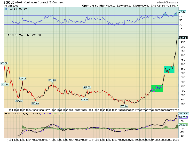 The chart shows two cup-and-handle formations since the famous gold spike of 1980. For technicians, cup-and-handle formations are among the most powerful indicators of upward movement. In this chart, the green box shows the handle of a formation created from from 1996 to 2005. When that handle broke upward, gold prices formed a second handle (blue box) which has now also broken upward. This extra large cup-and-handle formation - 28 years in the making - is a powerful indicator of more upward movement to come. Remember: gold is a proxy for most commodities, so this is also bullish for petroleum. Peter McKenzie-Brown Email: pmbcomm@gmail.com languageinstinct.blogspot.com March 18, 2008 |
| Home :: Archives :: Contact |
TUESDAY EDITION June 9th, 2026 © 2026 321energy.com |
|