The Great Divergence
Peter McKenzie-Brown
Email:
pmbcomm@hotmail.com languageinstinct.blogspot.com
March 12, 2008
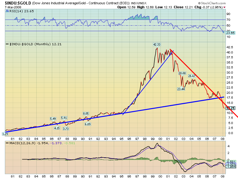
Think of gold as a proxy for commodities – essentially metals, energy and forest and agricultural products. If you can buy that idea and you are heavily into equities, this chart should make you very nervous. It shows you how much a single unit of the Dow Jones Industrials would cost in ounces of gold. Most recently, about 12 ounces would buy you one DJIA. By contrast, seven years ago you would have had to pay 41 ounces.
How useful is this information? In my view, it is something equity investors should take quite seriously. You will note that the chart begins at the exact tail end of the great commodity bull market of the 1970s, and the beginning of a 20-year commodity bear. By contrast, the huge downtrend since 2001 represents the beginning of a commodity bull which may put earlier markets to shame. For more on the bull in bullion, listen to this podcast of a conference call with investment analyst and best-selling author Don Coxe.
It seems to me that the chart is instructive for a number of reasons – the most important of which is to serve as a reminder that at the peak of the last commodity bull market, one ounce of gold would have bought you one unit of the Dow. Will we see the gold/DJIA ratio back to the levels of the 1980s – say, one DJIA for six ounces of gold or even fewer? Stay tuned. A doubling of the price of gold would do it, and the continued crumbling of the Dow would help. Some combination of rising commodity prices and declining share prices is likely.
There is support for this idea in an academic study conducted a few years ago by researchers from Yale and the University of Pennsylvania’s Wharton School. In a paper titled “Facts and Fantasies about Commodity Futures,” Wharton finance professor Gary Gorton and K. Geert Rouwenhorst, finance professor at the Yale School of Management, actually concluded that commodities are not as risky as stocks. Most important, commodities are “negatively correlated" with stocks and bonds, meaning their prices tend to rise when stock prices fall, and vice versa. That actually explains the huge divergences between gold and the Dow in the chart, which encompasses negatively correlated bear and bull markets in stocks and commodities.
Without putting too fine a point on it, Gorton and Rouwenhorst concluded that during the 45 years they studied (1959-2004) you’d have made more money in commodities than in stocks, with less volatility and a better inflation hedge – even during a long period which covered alternating bull and bear markets. How well could you do if you were investing in commodities during a raging bull market like the one that exists today? Think about it.
Gold-Oil: I created the charts in this article with my friend Carlo Magnifico. He’s one of the most interesting technical analysts I know, and his home page is worth studying.
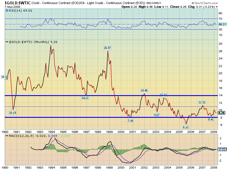
Here is our chart showing the gold/oil ratio. Basically, it suggests that, since the recent commodity bull began, an ounce of gold has been worth 8-14 barrels of oil. This ratio got wildly out of kilter after the 1986 oil price collapse, and stayed out of whack until oil supplies began to tighten at the beginning of the millennium. During commodity bulls, as illustrated here, the ratio tends to be much tighter.
As Carlo explains, “gold and oil both have real value and can’t be created out of thin air. There is always some sort of demand for both, and that demand is purely based on current supply, basically gold and oil are always at fair value against all paper currencies every day. So since gold and oil never change in value, they can be measured against each other.”
“If there is a major gold/oil divergence (disconnect),” he adds, “have a good look at the fundamentals. That will tip you off to opportunity.”
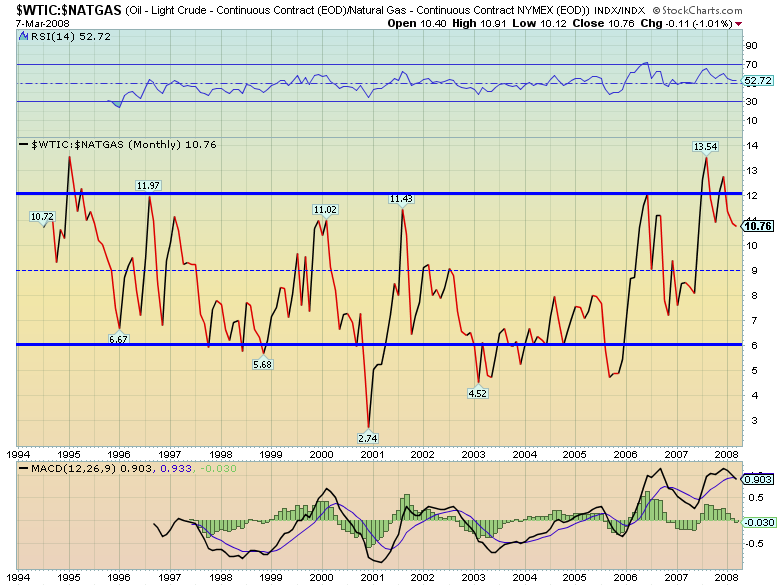
Gas-Oil: If you are an energy investor, this chart – the ratio of oil to natural gas – is more interesting still. Because oil and natural gas are both hydrocarbons and industrial consumers can substitute them for each other for many uses, a big price divergence means a correction will soon take place.
As this column pointed out last December, the decoupling of oil and gas could not last. I suggested then, and I still believe, that a natural gas squeeze is on. Check the chart; the dashed blue midline is a powerful magnet.
Peter McKenzie-Brown
Email:
pmbcomm@gmail.com languageinstinct.blogspot.com
March 12, 2008