|
SATURDAY EDITION May 2nd, 2026 |
|
Home :: Archives :: Contact |
 |
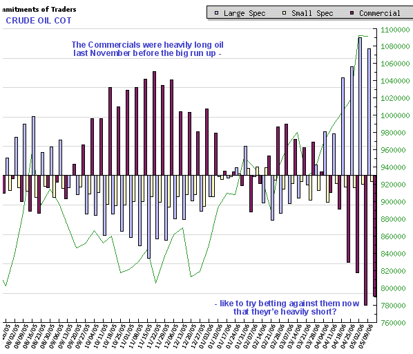
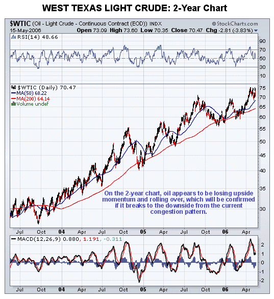
Oil Market Updateby Clive Maundwww.clivemaund.com May 17th, 2006 We will start our review of the oil sector today with a look at the latest Commitments of Traders (COT) chart for Crude Oil, because what this reveals is rather startling and considered to be bad news for those long the oil sector. On the COT chart presented below, the very large long position held by the Large Specs and the very large short position held by the Commercials, and the large Open Interest position, indicated by the wiggly green line, is immediately obvious. This is usually the recipe for a substantial downtrend. As we know, the Large Specs are almost always wrong, and the Commercials are almost always right, and for an example of this we need look no further than the COT situation when oil bottomed last November. Compare the COT chart at that time with the position of oil shown by the 2-year chart for West Texas Light – just as you would expect the Commercials were aggressively long and the Large Specs were short. One of the great things about these charts is that the Large Specs never get it, never put 2 and 2 together, and are almost always a sure fire indicator of what not to do. Thus this COT chart is giving us a warning, in the clearest possible terms, of a probable correction in oil and oil stocks that may well be severe.
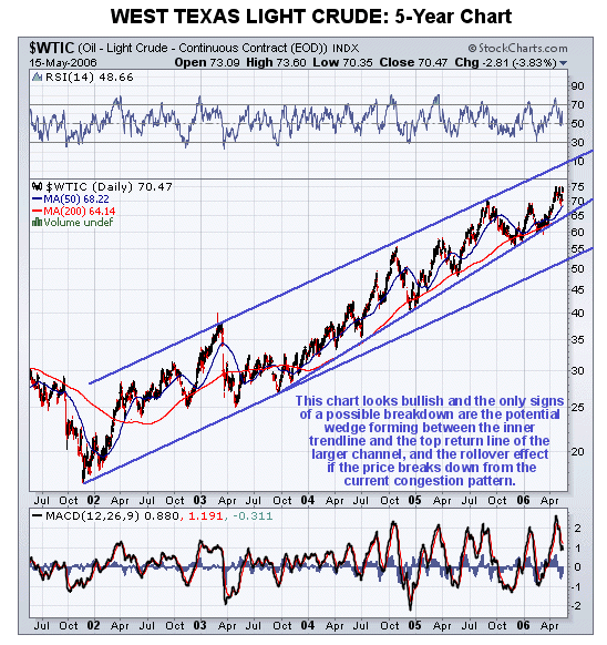
 With the COT chart so decidedly bearish there should surely be some indication of a looming downtrend in the charts of both oil and oil stock indices. So let’s now see if we can see it. The 5-year chart for West Texas Light Crude gives little indication of a looming breakdown, being at first sight, at least, a decidedly bullish chart. However, if we look carefully we can see that upside momentum is slowing, and it needs to break out upside from the congestion pattern of the past few weeks to partially obviate the implications of the recent slowing. A potential wedge is forming between the inner trendline shown and the upper long-term return line, and should it break down from this a retreat back to the lower long-term trendline is likely, which is currently in the $53 area. Here it should be noted that even if it dropped back to this trendline, the long-term bullmarket in oil will remain intact.
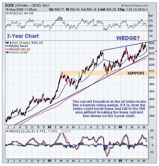
 The 2-year chart for oil has been placed with the COT above for direct comparison. On this chart we can see the recent slowing in more detail. The charts for the oil stock indices give more grounds for caution than the charts for oil itself, with the slowing and the rising wedge pattern being more pronounced. The 5-year chart for the OIX oil index, which shows the oil sector bull market in its entirety, makes it very obvious how upside momentum in the oil sector has slowed over the past year, and it is possible on this chart to make out the wedge pattern that has developed during this period, which has bearish implications.
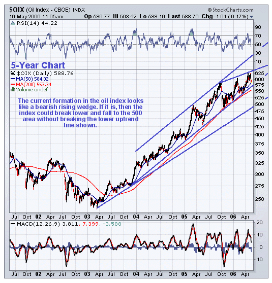 The wedge can be seen in more detail on the 2-year chart and it is clear that the index needs to break out above the top line to negate the bearish implications of this pattern.
 We’ve all read the stories about how the world is running out of oil and about how many more cars there will be on Chinese roads in 2015 etc. While this is no doubt true, and the long-term outlook for oil is bullish, these charts are suggesting that it will go down first before it goes up. A significant correction looks likely over the intermediate-term.
Clive Maund |
| Home :: Archives :: Contact |
SATURDAY EDITION May 2nd, 2026 © 2026 321energy.com |
|